After much anticipation, Pantone has announced its Colour of the Year for 2020 as Classic Blue.
Relatable, comforting and calming, the indigo hue has reassurance written all over it. After three years of political turbulence, the nation’s mood has certainly been blue. But Pantone’s take on the shade feels like a refreshing departure from doom and gloom to something brighter and more optimistic for a new decade.
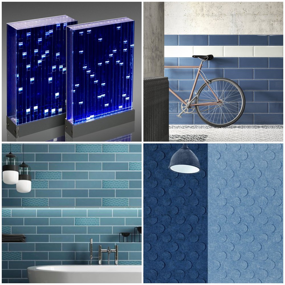
Reminiscent of the sky at dusk, it’s a universally connective colour that we’ve already seen making waves commercially. From Sensitile’s Lumina range to Form by Johnson Tiles and Tektura’s Zintra acoustic panels, our partners have fully embraced the blues for their latest collections.
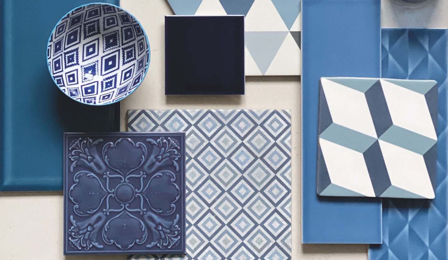
To inspire your upcoming projects, Johnson Tiles’ designer Amy Pears has created a moodboard showcasing their complementary products to help you ‘get the look’.

Johnson Tiles' trend board - curated by Amy Pears
In an interview with TIME magazine, Laurie Pressman, Vice President of the Pantone Color Institute, said of the selection: “It’s a reassuring blue, full of calm and confidence. It builds connection.
“The sky at dusk – it’s not a midnight blue, it’s thoughtful, but it’s not so deep and mysterious. It speaks to our feelings of anticipation, when you think about the sky at dusk, the day isn’t over. You’re thinking, what’s ahead of us? It’s reassuring, but thought-provoking.
“It highlights our desire for this dependable, anchoring foundation on which to build as we cross the threshold into a new era. We’re living in a time that requires trust and faith and confidence. We all see this blue sky and can relate to it, it’s approachable.”
To find out how Classic Blue could feature in your next interior scheme, pop into the studio - no appointment necessary. And let us know what you think of the selection on Instagram!