Looking forward to the year ahead, Pantone have announced their colour of the year 2022 - Very Peri. Following a year of turbulence, this unique design encourages us to embrace our ever-changing world, exploring new opportunities with a fresh perspective. And, for the first time in 23 years, the global colour authority has created a brand-new colour to “reflect the global innovation and transformation taking place”.
Encompassing the traditional, tranquil qualities most commonly associated with the blue colour family, this new shade symbolises the worldwide need for serenity and the trend for wellness-centred design. Nature-inspired tones such as greens, browns and neutrals have dominated the wellbeing design space, but we’re beginning to see a shift towards brighter shades. Back in September, Dulux announced “Bright Skies” as it’s colour of the year, taking inspiration from up above, and now Pantone have opted for a bright tone, influenced by the periwinkle plant.
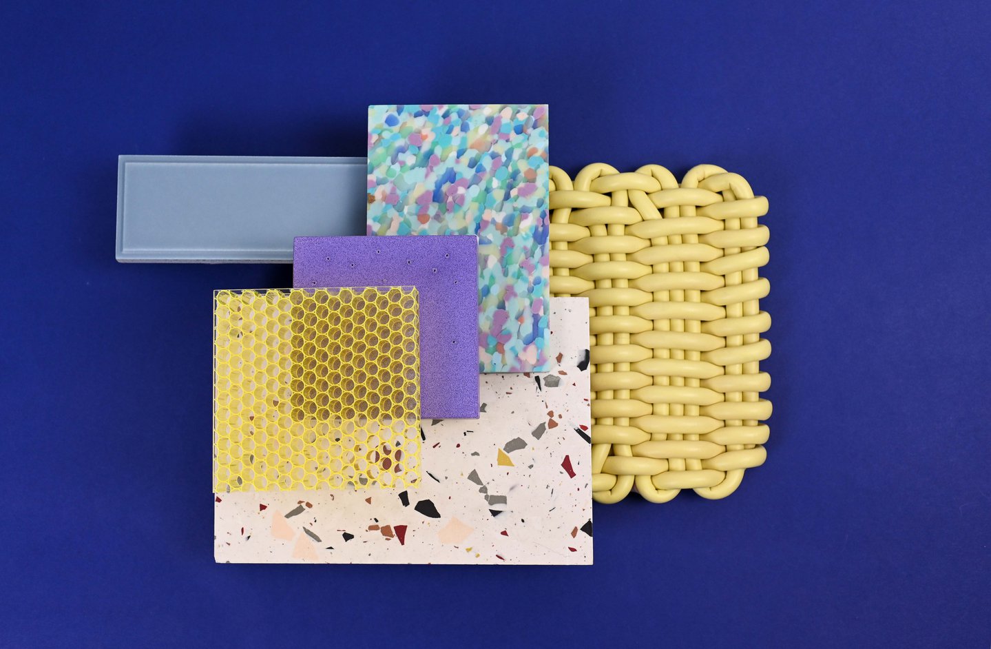
As we emerge from a period of isolation, now is the time to be daring and dynamic. The violet red undertones of Very Peri, combined with this classic blue shade, encourage courageous creativity and expression, setting the tone for a positive 2022. Feeling inspired? We’ve found a selection of materials, featuring this shade, to help you on your next design journey.
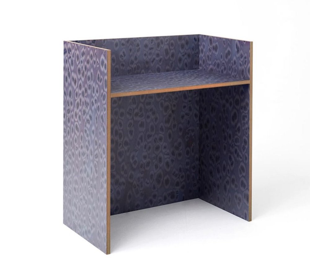
Often seen as a functional piece and lacking colour, this office desk is stepping into the spotlight, thanks to design studio LLot LLov. Pushing the boundaries of workplace design, this vibrant style shows how shades such as Very Peri can bring life to the lifeless, encouraging creativity and productivity through design. Combining a unique pattern with monochromatic style, this statement look can add a dynamic presence to any space. Based in Berlin, LLot LLov has a rare and interesting outlook when it comes to interior design. Merging pattern with playful tones, this abstract design can elevate a design scheme through its fresh and bold style.
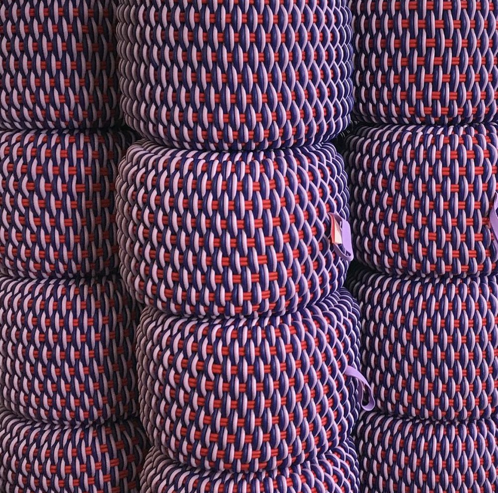
Combining function with beauty, Shore Rugs is pioneering the field of ergonomic rugs and soft furnishings. The wellness-focused design brand uses high-performance silicone cord to produce durable and resilient products that can be used both indoors and outdoors.
Featured here, these ottomans combine a background shade of vibrant red with purple and pink tones woven over the top. The overall colour is both striking and dynamic, resulting in a lively tone that’s similar to Pantone’s Very Peri. Pair with a neutral interior, to let these stools take centre stage, or go bold with matching violet tones for a multifaceted design scheme.
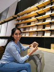
For more inspiration on how to use Very Peri in your next project, visit Material Lab to discuss the variety of materials that we have on display.