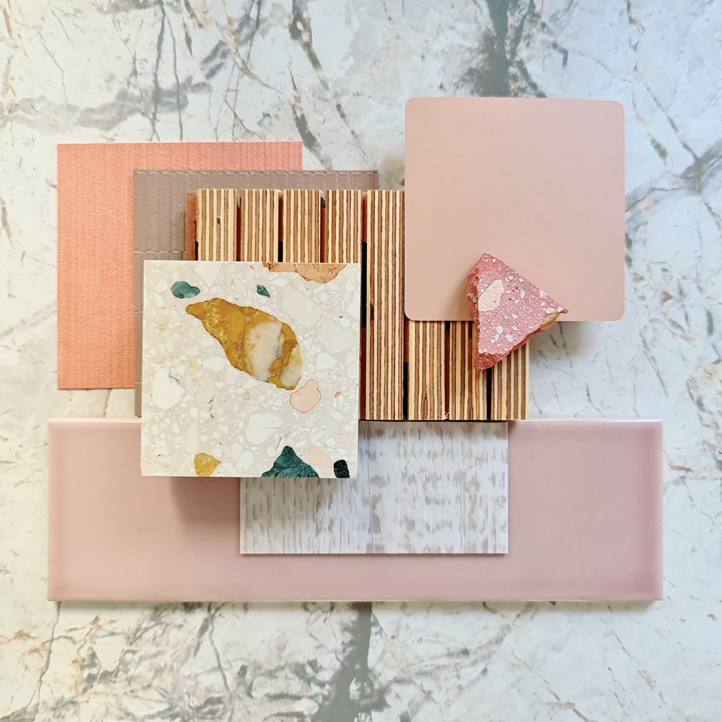
After receiving a very warm response from the architecture and design community, the colour forecasting agency has released a list of shades it’s expecting to be popular come Autumn/Winter. From pared back pinks offering a twist on the much-loved Millennial shade, to pops of fiery orange and red, there is a trend to suit every project. Here are our favourites…
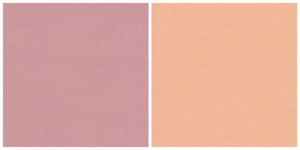
For the past two years, there’s seemingly been no escape from the ‘Millennial Pink’ trend. Every bar, hotel and retailer aimed at the twenty-something age bracket has, in some way, captured elements of the sugary hue in their interior – and Instagram content. However, for A/W2020, Pantone provides a more mature take in the form of Rose Tan. To complement, Peach Nougat – think Living Coral dialled right back – is a warming alternative to beige. Together, the combination retains its youthfulness while appealing to the maturing tastes of those pastel-loving, now twenty-going-on-thirty-year-olds.
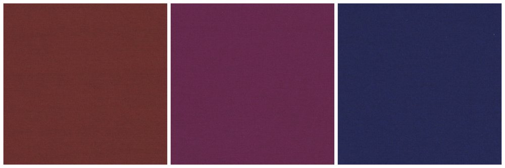
Despite a general industry shift to going back to basics, maximalism has prevailed as a trend since last year. Underpinning the look is a decadent, jewelled colour palette, rooted in luxury and indulgence. For A/W2020, Pantone has captured some of the key shades, inspired by design heritage but with a fresh uplift for contemporary interiors. This includes Fired Brick, Magenta Purple and Blue Depths.
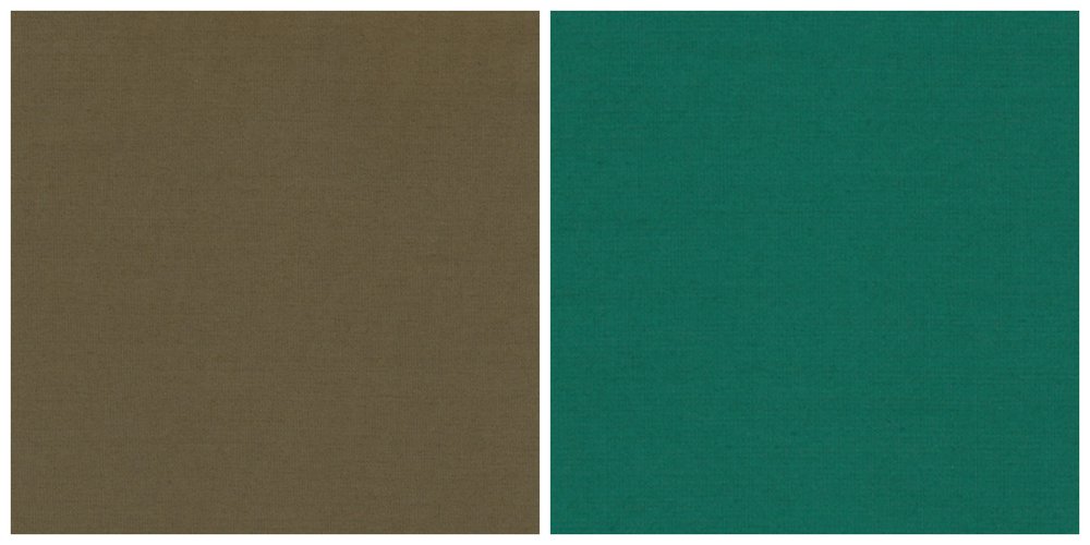
Taking creative direction from our natural surroundings, Pantone has elevated the nature-inspired trend through its approach to a green palette for A/W2020. Military Olive and Ultramarine Green reflect the industry’s current occupation with respecting both the land and sea. And while each shade is very distinct in aesthetic, both offer a unique take on a trend that was arguably starting to feel like well-trodden ground.
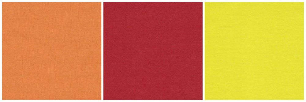
Last year, orange was tipped to be 2020’s hottest hue. And although it might not be quite as prolific as ‘Millennial Pink’, a quick scroll of Instagram proves that it’s definitely been a hit. Pantone has fully embraced the trend with its Amberglow - an orangey shade that’s not too in-your-face. In a similar vein, its Samba Red is verging on bright without going ‘all out’. Whereas Green Sheen – a highlighter yellow – offers the bold injection of colour that a select few projects cry out for.
If you’re interested in using any of these colour trends in your next commercial interiors project and would like advice on the products to specify, get in touch here.