Amid a rich selection of delicately suspended, woven textiles, gem-like backlit shards of coloured resin, multiple angled 3D forms and subtly moving spotlights, sits the consistent star of Hella Jonergius’ exhibition at the Design Museum; colour. As the designer herself states, however, this is not merely a celebration of all things chromatic, but a thought provoking challenge to how we perceive and create colour through design:
"Breathing Colour is an installation-based exhibition that reveals the full potential of colour, and how colours breathe with light. Through a series of phenomenological studies and experiences, the exhibition makes us question colour, one of the most elemental aspects of design."
Jongerius’ shares her preoccupation with how light affects our perceptions of colour, specifically highlighting the significant effect that changing light has upon colour. The show charts the potential shifts in colour that come at different times of day, namely morning, noon and evening. Jongerius recognises the differences between sharp and crisp morning light, intense midday light, which causes strong shadows and stark contrasts and the sense of colour gradually disappearing in the light of dusk.
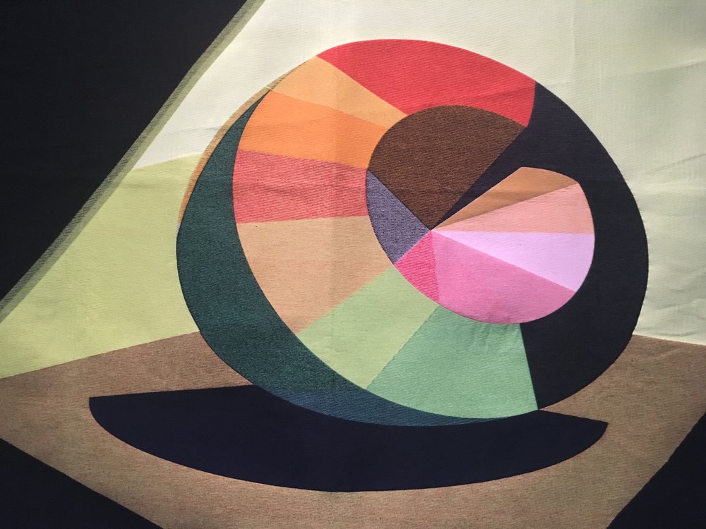
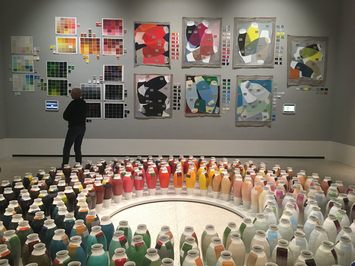
She seeks to capture such light qualities through a range of devices and techniques. Weaving, a process most akin to her background in textiles, allows for a natural mixing of coloured yarns through the weft and warp of the construction, and there are a number of sumptuously created tapestries throughout the show that aim to capture colour observed at various points in the day.
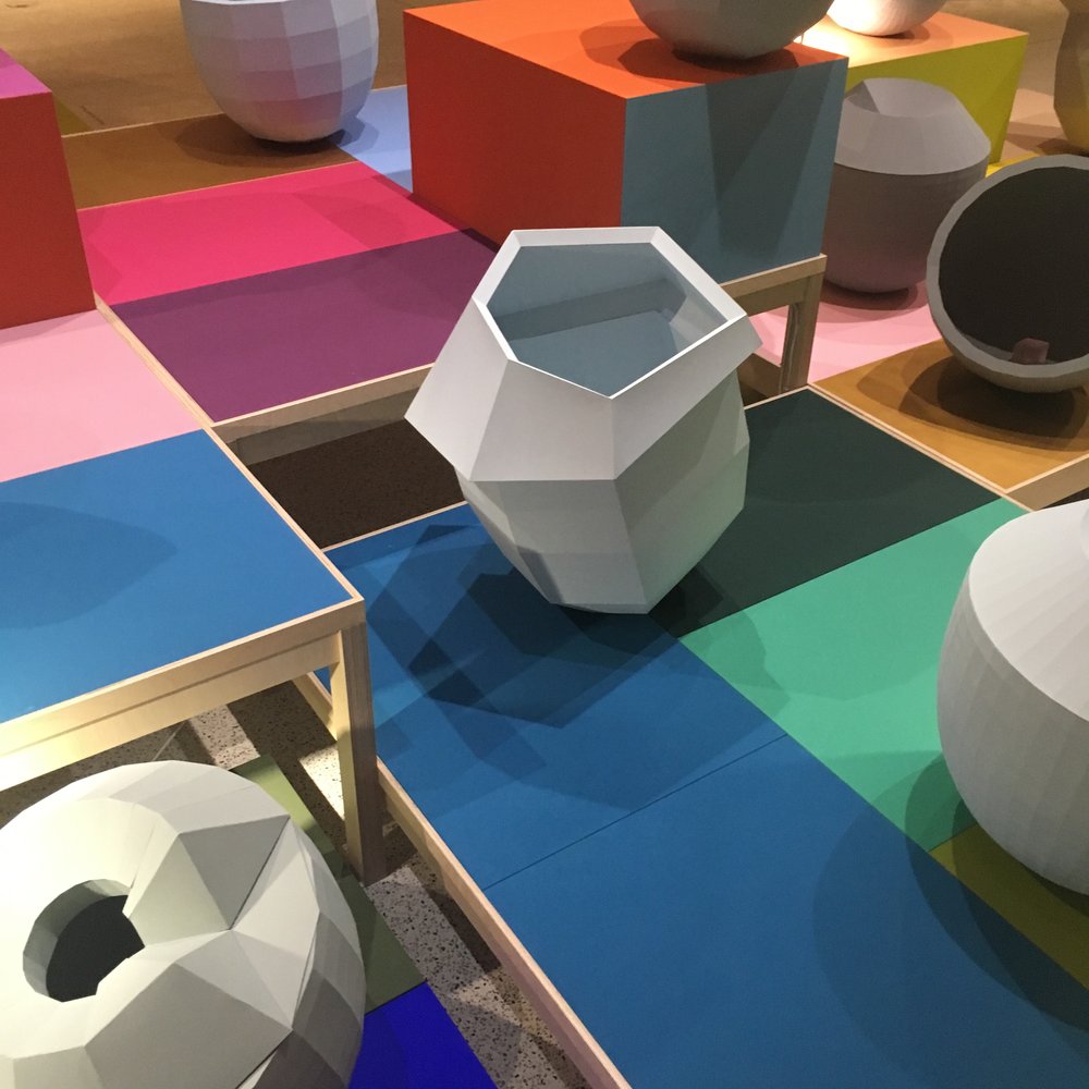
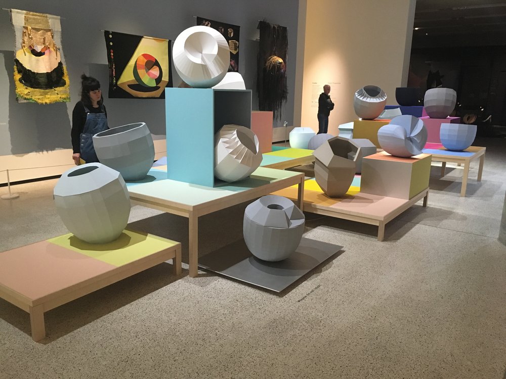
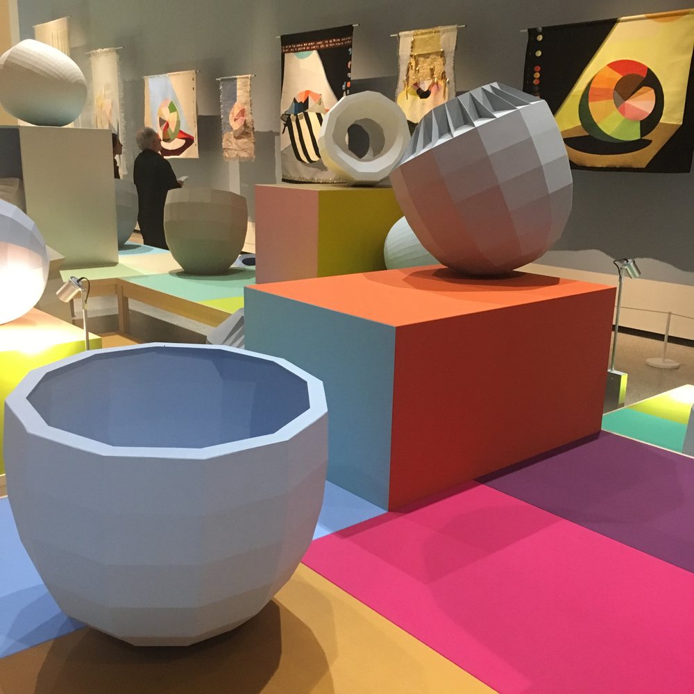
In the middle of the show a series of homogenously coloured 3D objects that evoke the shape and form of large pots or acorn shells sit at varying angles in a clustered group upon flat blocks of colour. Jongerius calls them Colour Catchers and expresses how she sees them as her canvases. The multiple angled and gridded faces create refractions; minor variations in how light hits the surface, which in turn creates a multitude of shades from the same starting colour. The same principle applies with her Folded Colours, which explores how folding and bending coloured paper can create new tones through the shadows created.
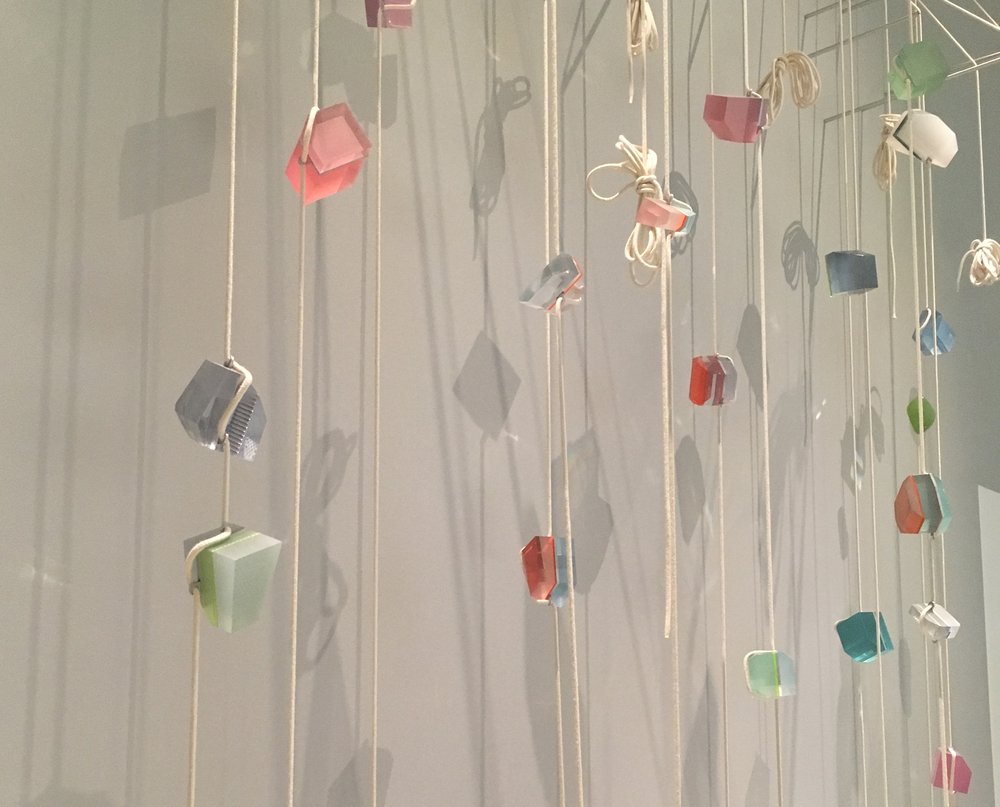
There is also experimentation with reflected colour, arguably the most intangible and often unnoticed type of colour we experience because of the nature of the light involved in creating it. Jongerius shares a series of suspended irregular shaped objects that are constructed from layers of coloured, yet still translucent, resin. Acting like morphed prisms these angular forms both capture and distort light back into the environment that surrounds them, creating ever-changing chromatic reflections throughout the day.
The beauty of the exhibition is that whilst there is a notable and consistent focus on colour, it is not fixed nor is it objective. As Jongerius states:
"Colour is a visual experience, not a scientific one. When I look at designers and colour theorists' work from the past, the most interesting ideas arose from questioning colour – they emerged from isolated and personal experiences. The fact that there is no objectivity in colour is a blessing to me."
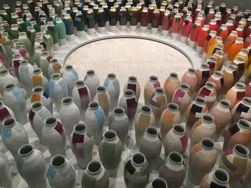
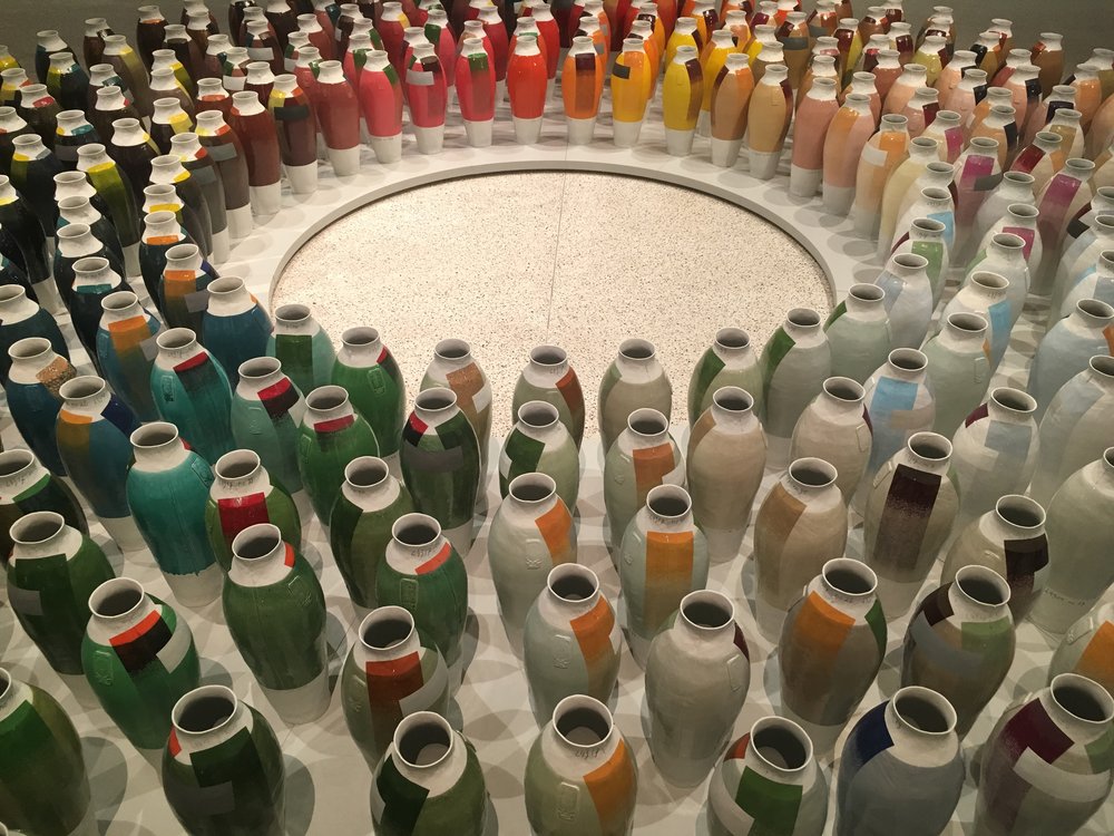
There’s significance to this statement and it opens the door to perhaps the most notable challenge that the show offers in cutting deeply through the contemporary rhetoric of industrialised design. As Jongerius points out, the traditional means of mixing colour throws up endless permutations, but it appears that this practice has been pigeon-holed as an ‘artistic’ rather than ‘design’ process. We have become used to seeing and selecting colour through paint charts or colour systems like NCS, Pantone and RAL, all of which are flat and predetermined colours that offer no sense of variation beyond the small block of colour on the printed paper or computer screen in front of us. The objectivity of such colour systems is authoritarian in nature and blinds us to the possibility of shade and tone variations of the colours on offer.
The most exhilarating element of this exhibition is that whilst exploring the pieces on display, one is acutely aware that not only might you perceive the work completely differently to the visitor standing next to you but you will see it differently yourself on a second viewing. It helps to galvanise a renewed appreciation for colour and notably the colour of all things. It’s Jongerius’ aim to "act as a filter between industry and consumers" and the hope must be that this show and the continued work she does with brands such as Vitra, Maharam and Danskina will help to push companies to make our everyday objects with a considered approach to colour as well as shape, form and texture, for they have such a huge bearing on how we perceive colour. Who could put it better than Jongerius herself:
"We live in an increasingly digital world, where our analogue and tactile experiences are becoming important. The surface and colour of an object define how we interact with it, how we use it at first and over time. A sense of touch and feeling strongly influence the relationship between object and user."
Breathing Colour runs until 24th September 2017