Colour is an intrinsic aspect of design that goes beyond mere aesthetics; it has the ability to shape our emotions, perceptions, and interactions with the world around us. When harnessed effectively, colour can elevate ordinary creations into extraordinary experiences, so understanding the principles of colour theory can be a real game-changer for designers.
Last month, we had the pleasure of hosting 'A Colour Essentials Masterclass Workshop' at our London Design Studio in conjunction with partners Johnson Tiles, VADO and Tektura Wallcoverings. The evening masterclass included talks and creative workshops led by the esteemed author and colour expert, Laura Perryman, providing a unique opportunity for designers, architects, and material partners to delve into the wonderful world of colour theory and explore its emotional properties.
Laura currently directs Colour of Saying, the UK-based and experience-driven CMF Design Studio that helps brands and organisations to harness colour and materials as agents of change. Having studied for a Master's degree in Textile Design from London’s Royal College of Art, Laura has an in-depth background in colour, knowledge of key materials in manufacture, and critical understanding of the trend prediction process. Skills she is now harnessing and sharing with others to help businesses with trend forecasts and sustainable material selection.

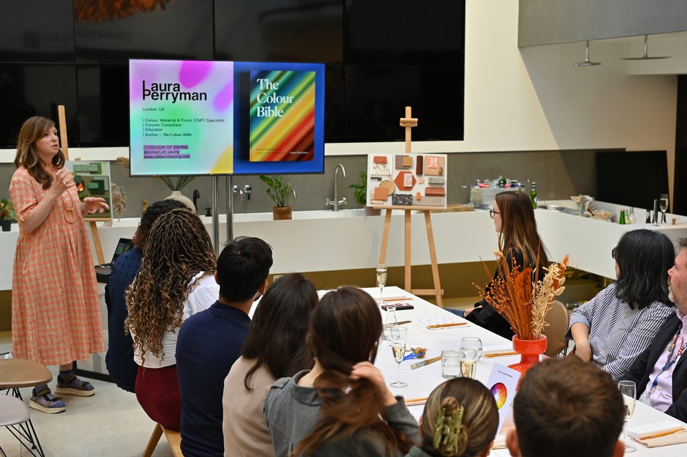
The Colour Masterclass gave architects and designers an introduction to Colour Theory, by author Laura Perryman
The evening began with Laura Perryman discussing the fundamental principles and basics of colour theory, drawing inspiration from her acclaimed book, The Colour Bible. With a keen focus on the interplay of tones, she demonstrated how certain colours possess the ability to convey simplicity and sophistication. Blues, in particular, were showcased as masterful tools to streamline forms and create a harmoniously uncluttered environment, free from distractions. Additionally, the combination of blues with biophilic, earthy shades of green produced an atmosphere of tranquillity, embracing a connection with nature. The rich and vibrant palette of reds, pinks, and purples, on the other hand, emerged as instruments for evoking warm, nurturing feelings.
Understanding these emotional properties empowers designers to purposefully utilise colour to set the appropriate tone and agenda for their projects, with the aim of connecting with their audience on a deeper level.

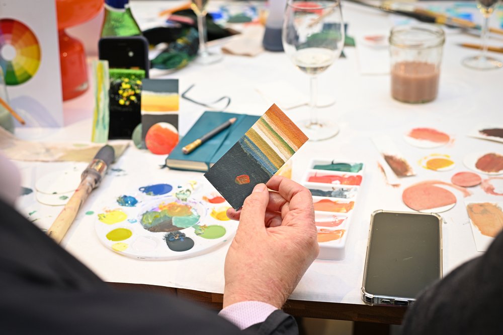
Workshop participants experimented with different coloured paints to build their own colour palette mood boards.
The workshop's interactive nature not only immersed participants in the power of colour theory but also provided them with a golden opportunity to draw inspiration from the diverse community of creatives surrounding them. In the first activity, attendees were encouraged to mix and observe colours inspired by images, objects, or excerpts from The Colour Bible. Armed with paints and inks, they explored a variety of colour combinations and made sensory connections with different shades.

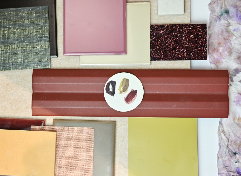
The chosen colour palettes were turned into moodboards using a wealth of materials from the design resource studio.
In the second activity, participants used their curated palettes to create vibrant mood boards, allowing them to transfer their newfound colour insights into tangible design concepts. The diverse range of materials and textures - including tile and wall coverings - sparked boundless creativity, resulting in unique and personalised mood boards that captured the essence of each participant's creative vision.
We extend our heartfelt thanks to the remarkable Laura Perryman for her insightful guidance, and to all the participants who contributed to this enriching workshop.
If you’re keen to get involved yourself, why not come and pay our design resource studio a visit? Here, you can use the materials from our workshop to create your own mood board or flatlay, perfect for mastering the art of colour theory.